Just adding some thoughts to the 'Selected items' appearance.
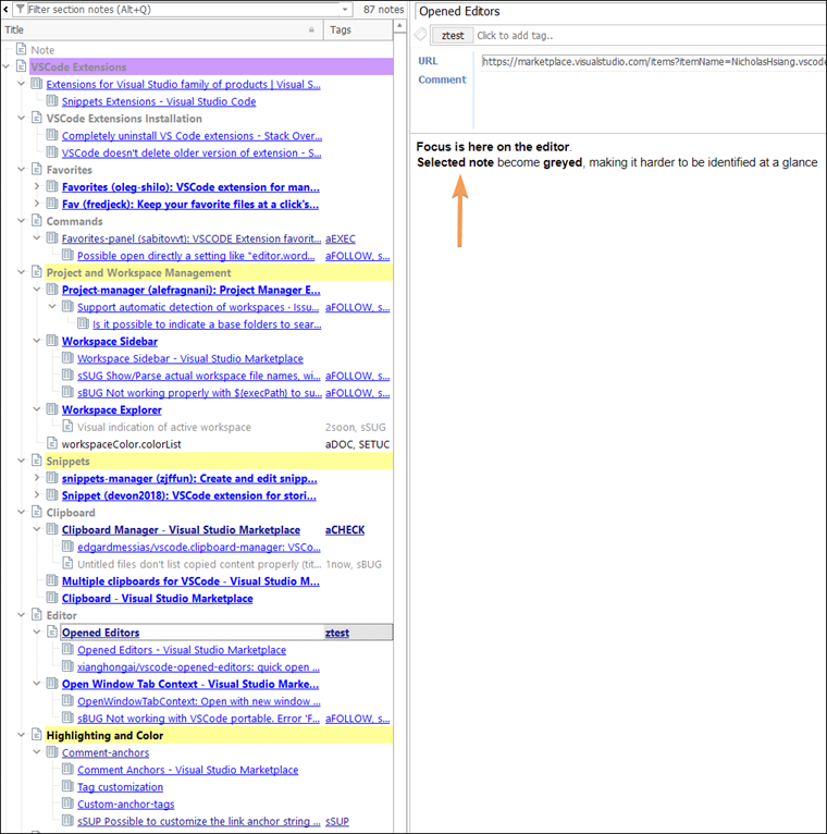
When the
focus is on the editor, the selected note becomes
greyed, making it harder to be identified at a glance.
I've attached a screenshot of real-world tree with the focus on the editor.
After spending some time working on the editor content, I usually forget the position of the edited note.
And for me to identify the 'selected item' again isn't an immediate action mostly.
=> So I suggested in my first post the user customization for the 'selected items' appearance.
But any slight improvement in the contrast or elements that makes the 'Selected items' pops-up to the view is very welcomed.
- MyInfo_2022-03-11_11.20.57.png (225.18 KiB) Viewed 2176 times